U.S. flag

An official website of the United States government

The Fifth National Climate Assessment (NCA5) represents the latest science in assessing changes in the climate, its national and regional impacts, and options to reduce present and future risk. Every five years, the U.S. Global Change Research Program releases a new National Climate Assessment. The newest assessment, NCA5, is a resource to understand how drought will change as the climate changes, how we can adapt, and how future droughts might impact your region and livelihood. 

Check out these 10 maps and graphics to learn more about drought in a changing climate. 

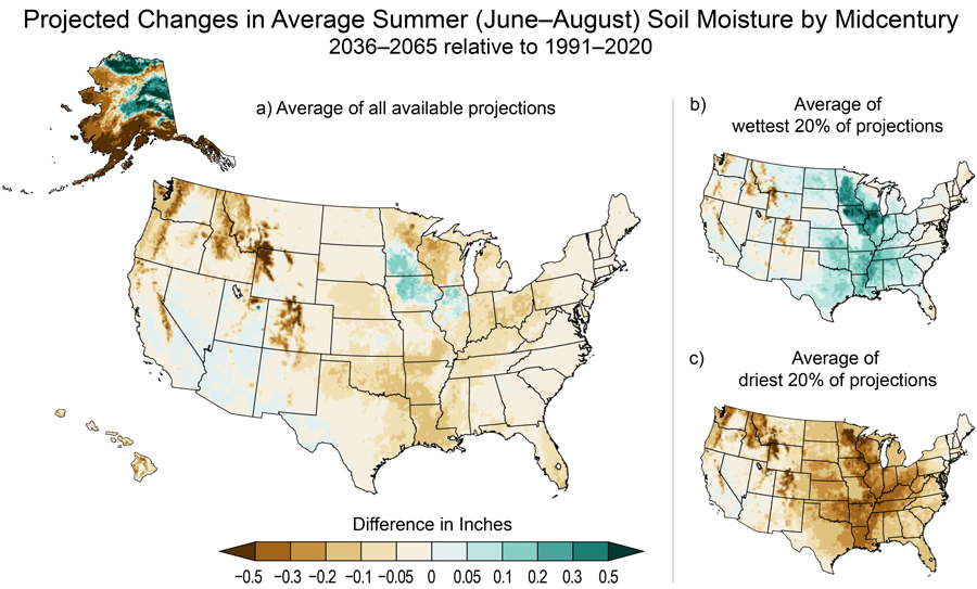
Summer soil moisture will likely decrease 

One of the ways we can understand drought is through the water stored in soil, soil moisture. Soil moisture supports agricultural crops and ecosystems and is a factor in how much precipitation and snowmelt becomes runoff in streams and rivers. Across most of the U.S., summer soil moisture is expected to decrease, with the greatest decreases in southern Alaska and the mountain ranges of the Western U.S. 

Learn more about projected changes in drought in the water chapter

 Three maps of the contiguous United States, plus one map each of Alaska and Hawaii, show projected changes in average summer (June–August) soil moisture for 2036 to 2065 relative to 1991 to 2020 under an intermediate scenario (RCP4.5), as described in the caption and text. A legend shows the difference in inches ranging from less than minus 0.5 (dark brown) to more than plus 0.5 (dark teal). In an average of all available projections (panel a at left, contiguous US, Alaska, and Hawaii), most of the contiguous US shows decreases in summer soil moisture, with the largest decrease (up to minus 0.5) in mountainous areas of the Northern Great Plains, Northwest, and Southwest. Some areas of the Southwest show increases of up to 0.05 inch, while parts of Illinois, Iowa, and Minnesota show increases of up to 0.2 inch. Alaska shows large decreases (up to minus 0.5 inch) in the south and west and large increases (up to plus 0.5 inch) in central and northern areas. Hawaii shows decreases of up to 0.3 on the Big Island, Maui, and Kauai. In an average of the wettest 20% of projections (panel b, top right, contiguous US only), much of the Great Plains, Midwest, and western parts of the Southeast show increases, with the largest (up to 0.5 inch) in Illinois, Iowa, and Minnesota. Mountainous areas of the Northern Great Plains, Northwest, and Southwest show decreases of up to 0.5 inch. In an average of the driest 20% of projections (panel c, bottom right, contiguous US only), almost all of the contiguous US shows decreases, with the largest (up to minus 0.5 inch) in the Midwest, western parts of the Southeast, and mountainous areas of the Northwest and Northern Great Plains. A few areas in California, Nevada, Utah, and Arizona show small increases of up to 0.05 inches.
Under an intermediate scenario, soil moisture is projected to decrease during the summer months for most of the country (a), with the West seeing decreases even under the wettest projections. Exceptions include portions of the Upper Midwest and Alaska. The range between the wettest (b) and driest (c) projections illustrate the uncertainty in summer soil projections. Figure credit: University of Colorado Boulder, NOAA's National Centers for Environmental Information (NOAA/NCEI), and the Cooperative Institute for Satellite Earth System Studies in North Carolina (CISESS NC).

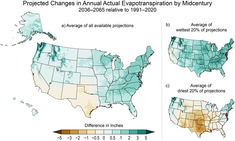
Evapotranspiration will change

For the most part, precipitation has increased in the Eastern U.S. and decreased in the Western U.S. over the 20th–21st centuries. But across nearly the entire nation, average annual temperatures are rising. That warming alters the amount of evapotranspiration, a measure of the water used by plants and evaporating from the earth’s surface into the atmosphere. Actual evapotranspiration represents evaporative demand limited by the amount of water available to evaporate or transpire from plants into the atmosphere. This measure of evapotranspiration has trended lower in the Southwest as water availability has decreased, while it increased in the East and North. These trends are expected to continue under climate change. 

 Three maps of the contiguous United States, plus one map each of Alaska and Hawaii, show projected changes in annual actual evapotranspiration for 2036 to 2065 relative to 1991 to 2020 under an intermediate scenario (RCP4.5), as described in the caption and text. A legend shows the difference in inches ranging from less than negative 5 (dark brown) to more than positive 5 (dark teal). In an average of all available projections (panel a, left, contiguous US, Alaska, and Hawaii), the southern portions of the Southern Great Plains and Southwest regions show decreases of less than 0.5 inch to 1 inch, while the rest of the country generally shows increases of less than 0.5 inch to 3 inches, with the largest increases in the Northwest, Northeast, and northern parts of the Southeast. Most of Alaska shows increases of less than 0.5 to 3 or more inches, with the largest increase in southeast parts of the state. A few areas of Alaska and Northwest show increases of 5 or more inches. Hawaii shows increases of 0 to 1 inch, with the largest increases in windward parts of the islands. In an average of the wettest 20% of projections (panel b, top right, contiguous US only), almost all of the contiguous US shows increases; changes range from less than 0.5 inch to 5 inches, with the largest increases in the Northwest and Mid-Atlantic. Decreases are  projected only for some parts of California, with changes in the range of less than 0.5 inch to 1 inch. In an average of the driest 20% of projections (panel c, bottom right, contiguous US only), the Southern Great Plains, eastern parts of the Southwest, and western parts of the Midwest and Southeast show decreases of less than 0.5 inch to 5 inches, with the largest decreases in Texas and Oklahoma. The Northwest and Mid-Atlantic show increases of up to 5 inches, and the Northeast increases of up to 3 inches.
Actual evapotranspiration is the water that evaporates from soil and surface water or transpires from plants. Under an intermediate scenario, actual evapotranspiration is expected to decrease in regions with decreasing or unchanging precipitation, such as the U.S. Southwest, the Southern Great Plains, and the Caribbean. Wetter regions, including the Northwest, Alaska, and the eastern half of the U.S., will see higher actual evapotranspiration. The wettest and driest projections (b, c) illustrate the range of uncertainty. Figure credit: University of Colorado Boulder, NOAA/NCEI, and CISESS NC.

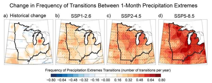
Drought will look different across the nation

Climate change will cause drought to look different across the U.S. In the Western United States, more snow is expected to fall as rain, and mountain snowpacks are expected to melt earlier in the season, driving snow drought. In areas where snow is the dominant source of runoff, this will stress water supplies. In the Midwest, precipitation is expected to become more variable in winter and spring, making the region more susceptible to flash droughts, the rapid onset or intensification of drought. Along coasts and on islands, drought can drive saltwater intrusion into the water table, reducing the amount of fresh groundwater available. NCA5 includes chapters on the regional impacts of climate change, including changes in drought. Find the chapter for your region

 Four maps of the Midwest illustrate change in frequency of transitions between one-month precipitation extremes, as explained in the caption. The legend shows frequency of precipitation extreme transitions (in number of transitions per year) from negative 0.80 (dark blue) to positive 0.80 (dark red). The left panel shows historical change, with the highest rate of change, about 0.48, in central Michigan, although areas of Missouri, Illinois, Indiana, and Ohio also experienced increases of 0.16 to 0.24. Most of Iowa, Minnesota, and Wisconsin saw little change. In the center-left panel showing the SSP1-2.6 scenario, large areas of Illinois, Indiana, and Ohio are projected to see changes of about 0.16, while the other states are projected to see slightly larger changes, in the 0.32 range. Black dots, which indicate grid cells where the model-projected transition frequency is significantly different from the historical climatology, are shown across Minnesota, Wisconsin, Iowa, Missouri, and northern Illinois. In the center-right panel showing the SSP2-4.5 scenario, a swath of southern Minnesota and Wisconsin, northern Illinois, and Michigan are projected to see the largest changes, in the range of 0.48 to 0.54; other areas see changes in the 0.24 to 0.32 range, and black dots are shown across the entire region. In the right panel showing the SSP5-8.5 scenario, changes of up to 0.70 or more are expected across much of Wisconsin, Illinois, Michigan, Indiana, and Ohio, with slightly smaller changes in other areas. Black dots are shown across the entire region.
Transitions between wet and dry periods are expected to become more frequent across the Midwest. Observed changes in transition frequency (transitions from wet to dry or dry to wet), based on the Standardized Precipitation Index (SPI), are represented by the difference between the periods 1951–1980 and 1981–2010 (historical change, panel a). SPI is a statistical index that quantifies the relative intensity of drought or wetness, and monthly SPI values show transitions over short periods. Projected changes in transition frequency under low (SSP1-2.6; b), intermediate (SSP2-4.5; c), and very high (SSP5-8.5; d) scenarios are represented by the difference between the periods 2071–2100 and 1981–2010. Adapted from Chen and Ford 2023. [CC BY 4.0]

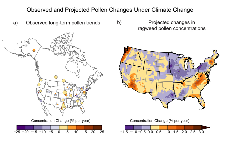
In a changing climate, drought will have a greater impact on human health 

Depending on where you live, your allergies might be getting worse. The amount of pollen in the air has increased and is projected to continue to increase in many parts of the U.S. More plant and soil particulates that reduce air quality are expected to enter the atmosphere in warmer and drier conditions. But drought’s impact on human health can be far more serious than a runny nose. Drought is responsible for approximately 99 deaths per year over the last 40 years, measured by deaths associated with U.S. Billion-Dollar Weather and Climate Disasters as of 2022. In 2023, that number increased to 102 deaths per year. That number is likely underreported, as it only accounts for heat-related deaths accompanying droughts. 

There are a number of other ways drought can drive mortality. Drought can lead to decreased air quality, resulting in an increase in cardiovascular and pulmonary disease and premature death. It can degrade water quantity and quality, increasing exposure to contaminants such as heavy metals and bacteria. And it is associated with worsening mental health among rural farmers in the U.S.

Learn more about climate change and human health in the air quality and human health chapters.

 At left: a map of the continental United States shows observed trends in annual total pollen from 1990 to 2018 as described in the caption. Colored circles at various locations in the contiguous US (abbreviated CONUS), plus one location in Alaska and two in Canada, show the percent change per year, with the legend ranging from negative 25 (dark purple) to positive 25 (brownish red). Larger circles indicate stations with more years of data. Stations with longer records and the largest increases are in Texas, Oklahoma, Kansas, Nebraska, Missouri, Canada, and Alaska. Other increases are shown in the Southeast and in Mid-Atlantic states. Other stations in the Southeast show a decrease, as do some stations in the Northeast and California, and single stations in Oklahoma, Colorado, and Utah. At right: a map of CONUS shows projected changes in ragweed pollen concentrations in 2047 compared to 2004. A legend shows percent concentration change per year from negative 1.5 percent (dark purple) to greater than 3 percent (dark brown). The largest increases in ragweed pollen concentrations are projected for the coastal Northwest, southeast California, southwest Arizona, southern Vermont and New Hampshire, and the Appalachians from northwest Georgia to central Virginia. The largest decreases are projected for eastern Texas, central Mississippi, western New York and Pennsylvania, and across most of the Midwest region except for portions of Wisconsin and Michigan. The Northern Great Plains show a mix of small increases and decreases.
Left: Observed long-term pollen increases are shown as the linear trend of total annual pollen at 60 stations (1990–2018). Right: Modeled projected changes in average airborne ragweed pollen concentrations in 2047, relative to 2004, are shown for climate change conditions under a very high scenario. Yellow and red shades indicate increases in pollen concentrations, and circle size in panel (a) reflects the number of years of data at each station. Observations are not available for many U.S. states and affiliated territories, and the modeled projection does not include non-contiguous U.S. states and territories. There is a net increase in concentration overall, with marked increases in certain areas and declines in others. Panel (a) adapted from Anderegg et al. 2021; panel (b) adapted from Ren et al. 2022. [CC BY 4.0]

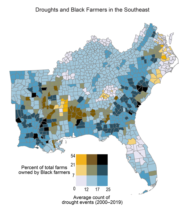
Drought’s disproportionate impact  

While all regions are impacted by drought, some people are more vulnerable to negative impacts of drought due to socioeconomic factors.

For example, climate stressors, including drought, disproportionately impact small-scale, Black, Indigenous, and economically disadvantaged farmers. These groups are more likely to be under-resourced, making adaptation to climate change more difficult. An increase in drought is also expected to drive a northward spread of Valley fever, a respiratory disease, which infects people when they inhale dust that contains the Valley fever fungus. Valley fever tends to afflict construction and agricultural workers, and the disease disproportionately impacts Black and Latinx populations, possibly due to occupational exposure.

Learn more about how climate change impacts Indigenous Peoples and Social Systems and Justice.  

 A county-level map of the Southeast region illustrates the overlap between Black-owned farms and drought events, as described in the caption. A bivariate grid legend appears below the map. The y-axis shows percent of total farms owned by Black farmers, with values ranging from 0 to 54, and the x-axis shows average count of drought events for 2000 to 2019, with values ranging from 0 to 25. Counties with the highest percentages of Black-owned farms (7 to 54 percent) and highest numbers of drought events (12 to 25) are shown in portions of eastern and southern Arkansas; western and east-central Mississippi; central Alabama; southwestern Tennessee; southern Georgia; northern Florida; southern and northeastern Virginia; northeastern North Carolina; and northern, central, and southern South Carolina. Areas showing the lowest percentage of black-owned farms (0 to 7 percent) and lowest number of drought events (0 to 12) are shown in portions of northwestern and northeastern Kentucky, western Tennessee, east-central Mississippi, northern Alabama, northern Georgia, northwestern and southeastern Virginia, eastern North Carolina, and central Florida.
In the Southeast, areas with a higher number of drought events from 2000 through 2019 often overlapped with counties that are home to relatively higher proportions of Black producers, as identified in the 2017 USDA Census of Agriculture. Figure credit: Groundwork USA, University of Georgia, NOAA/NCEI, and CISESS NC.

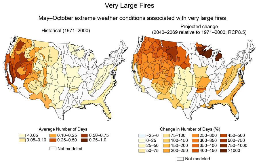
More drought, more risk of big fires

Wildfires are worsening by a number of different metrics in a changing climate. The amount of forest burned in the Western U.S. has increased since the mid- to late-20th century, in part due to higher rates of evapotranspiration and warmer temperatures. Fires are not only burning more land; they are becoming more severe. The area burned by high-severity wildfires has also increased in warmer, drier conditions. Increased fire severity is expected to become more widespread in U.S. forests in the future as extreme weather conditions become more frequent.

Learn more about climate change and wildfire in the forests chapter

 At left, a map of the contiguous US shows the model simulated average number of days per year from May through October with extreme weather conditions that are associated with very large fires for 1971 through 2000, with the land area divided into Bailey ecosections as explained in the text and caption. A legend titled “average number of days” shows six colors indicating values ranging from less than 0.05 days (light yellow) to 0.75 to 1.0 (dark red); gray indicates areas not modeled. Areas along much of the Atlantic and Gulf coasts show values of up to 0.10. The Appalachian Mountains show values of less than 0.05. Portions of the Northern and Southern Great Plains show values up to 0.10. Much of Northwest, Southwest, and western portions of the Northern Great Plains show larger values, ranging from 0.1 up to 1.0. Other areas of the Northeast, Southeast, Midwest and eastern portions of the Northern and Southern Great Plains are not modeled. The map at right shows projected changes in the number of days for 2040–2069 compared to the 1971–2000 average for the RCP8.5 scenario. The legend indicates percent changes in number of days, with light blue indicating decreases of up to 25% and 15 shades of yellow to dark red showing increases ranging from 0–25% (light yellow) up to greater than 1000% (dark red); gray indicates areas not modeled. The same areas are shown as modeled as in the map at the left. Nearly all such areas show increases, with one exception being small decreases in southern Florida. Most areas show increases of 25%, with generally larger increases at more northern latitudes, with changes of more than 450 percent in portions of the Northern Great Plains and Northwest, and changes of more than 1000 percent in portions of the upper Midwest.
Conditions conducive to very large fires are projected to increase. The left panel shows historical (1971–2000) values for the annual number of days in May through October with extreme weather conditions conducive to very large fires (more than 12,000 acres). The right panel shows the percent change in the number of days for a projected future (2040–2069) climate under a very high scenario (RCP8.5). The number of days with conditions associated with very large fires more than doubles in many ecosections, with more than a fourfold increase for parts of the Northwest, fivefold for the northern Rockies, and over sevenfold for the Upper Midwest. Areas with no color indicate lack of data (where sufficient data are unavailable or where wildfires were historically rare). Figure credit: U.S. Geological Survey.

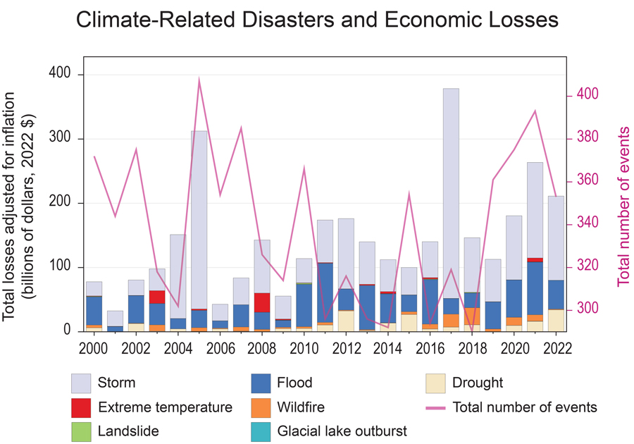
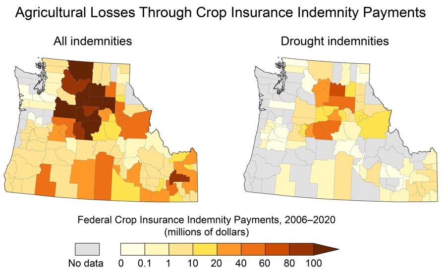
The economic cost of drought 

Drought can also impact many sectors of the economy. In times of drought, the agricultural industry faces reduced yields and may see increased costs for healthcare and to maintain soil, crop, and livestock health. This can lead to increased crop insurance loss payments and other federal and state aid. Drought can reduce the amount of water available for hydropower and contribute to degraded energy infrastructure. Wildfire, which can be exacerbated by drought, can damage energy generation systems. Low water levels in rivers can slow down shipping on large rivers, and extreme heat can buckle railways. The outdoor recreation industry can lose revenues as drought negatively impacts ecosystems that support hunting and fishing, reduces water levels for water-based recreation, and limits snowpack. Exposure to climate hazards such as heat, wildfire, and drought can lower a home’s value, which can in turn reduce property tax revenues for governments.

Learn how climate change is impacting ecosystems, transportation, energy, and other sectors in topical chapters

 A time series chart with stacked bars and a line shows financial losses due to weather and climate disasters from 2000 to 2022, as described in the text and caption. Left y-axis shows total losses, with values ranging from $0 to $400 billion in 2020 dollars, adjusted for inflation. The right y-axis shows the total number of events, with values ranging from about 290 to more than 400. The stacked bars show the total losses each year, with colored segments indicating the portions attributed to seven types of events, described in the legend as follows: gray for storm; red for extreme temperature; green for landslide; dark blue for flood; orange for wildfire; light blue for glacial lake outburst; and light brown for drought. The total number of events, shown by a pink line, varied greatly, with highs of more than 380 events in 2005, 2007, and 2021, and lows of fewer than 300 events in 2011, 2013, 2014, 2016, and 2018. The greatest financial losses occurred in 2017 (more than $375 billion), 2005 (more than $300 billion), 2021 (more than $250 billion), and 2022 (more than $200 billion). The smallest losses occurred in 2001, 2006, and 2009, with less than $50 billion in losses in each of those years. In general, most of the financial losses, particularly in years with the largest damages, were generated by storms, followed by floods, drought, and wildfire.
This figure shows global trends in the number, growing costs, and increasing diversity of types of climate-related natural disasters since 2000. The total global losses associated with climate-related disasters have risen over the last two decades. There is little correlation between losses and total number of disasters (suggesting increased losses may derive from increasing severity of disasters, increased value of assets, reporting discrepancies, or a combination of these). Figure credit: U.S. Department of the Interior, Winrock International, NOAA/NCEI, and CISESS NC.
 Two maps show crop losses in the Northwest by county, as revealed through crop insurance indemnity payments. A legend shows federal crop insurance indemnity payments from 2006 to 2020 from 0 (white) to more than 100 million dollars. The map at left, covering all indemnities, shows that the largest losses, of greater than $100 million, occurred in central Washington and north-central Oregon. Some counties in south-central Oregon and north-central, southern, and eastern Idaho saw losses in the $40 to $80 million range. Coastal regions saw the smallest losses, ranging from 0 to $10 million. In the map at right, covering drought indemnities only, similar patterns emerge. The largest losses—of $20 to $80 million—are in central Washington and north-central Oregon and Idaho, while counties in the rest of the region saw losses from 0 to $10 million. A handful of counties show no data, indicated in gray, for all indemnities, while a larger number of counties throughout the region show no drought indemnities data.
Increasing trends in crop insurance loss payments reflect the economic disruption of agricultural production due to extreme events, including droughts. These county-level maps compare all crop insurance indemnity payments from the U.S. Department of Agriculture Risk Management Agency (left) with those specifically due to drought (right), from 2006 through 2020. All indemnity payments reflect biophysical and socioeconomic impacts from weather- and climate-driven events on commodities such as wheat and potatoes. Figure credit: U.S. Department of Agriculture

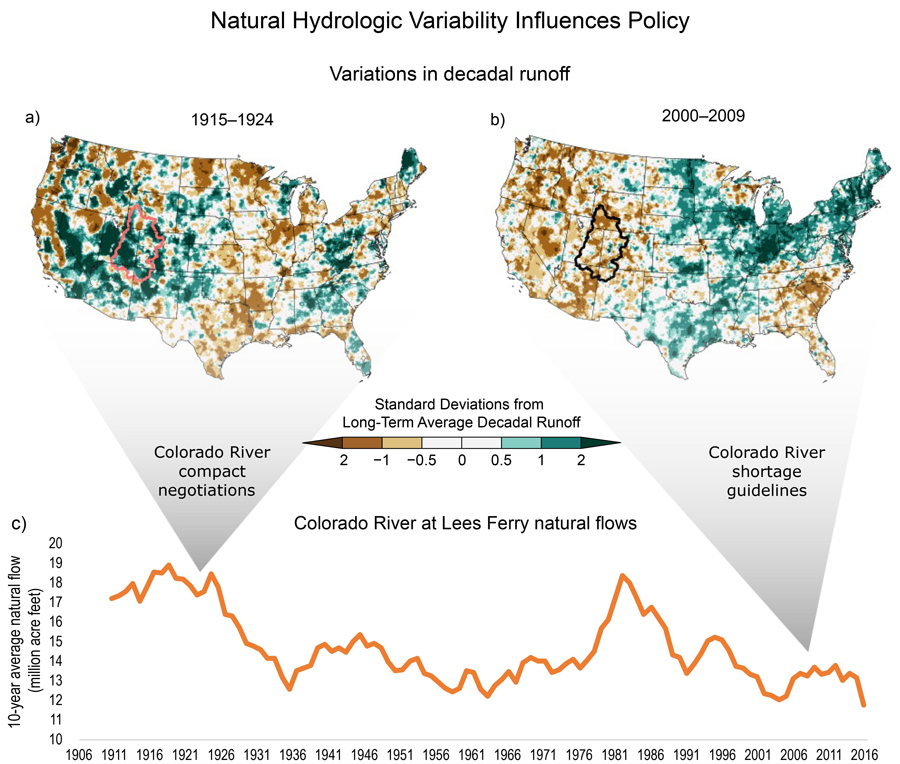
Drought impacts policy

Drought can result in competition, collaboration, or conflict over water. Historically, very wet and very dry years have inspired policy action. After 22 years of drought in the Colorado River basin, water managers created guidelines to restrict water use in times of shortage on the Colorado River in 2007. In contrast, after the wettest period in the past 1,200 years, the 1922 Colorado River Compact divided the river between seven western states, and it allocated more water than the river provided. As climate change continues, the variability of our natural systems is expected to continue as well, creating challenges to plan for and create policies to adapt to climate change.

Learn more about drought and policy under climate change in the water chapter. 

 Two maps of the contiguous United States and one time-series graph illustrate how natural streamflow variability influences policy. A legend for the maps shows standard deviations from long-term average decadal runoff ranging from minus 2 or less (dark brown) to plus 2 or more (dark green). The left map shows that the Southwest was wetter than average over the period 1915 to 1924, with large areas showing standard deviations of 2 or more wetter than the long-term average. The right map shows that the Southwest was drier than average over the period 2000 to 2009, with standard deviations in many areas of minus 0.5 to minus 2. The time series graph shows natural flows on the Colorado River at Lees Ferry from 1906 to 2016. The y-axis shows 10-year average natural flow in values ranging from 10 to 20 million acre-feet. Flows were particularly high (about 18 million acre feet) during the 1910s and early 1920s; a wedge indicates that this was when the Colorado River Compact was negotiated. Flows then plunged to below 14 million acre feet in the 1930s, remaining in that range into the 1970s before climbing above 18 million in the 1980s. Flows then declined again, and have been below 14 million since the 1990s. A second wedge indicates that the Colorado River Shortage Guidelines were developed during the current period of low flows.
The figure shows hydrologic variability in both space and time: (a, b) runoff variability across the country between two decades, with the boundary of the Upper Colorado River Basin shown; and streamflow variability across time with (c) estimates of Colorado River flows from historical observations. Wedges point to two negotiated policy events. Figure credit: Lynker and University of Colorado Boulder.

It’s not all doom and gloom 

A hotter, drier future can be scary to think about, but the NCA5 focuses on what we can do about it. Each chapter highlights adaptation strategies communities are already taking to manage drought, wildfire, and heat. It also describes transformations and adaptations we can implement as we plan for this future.

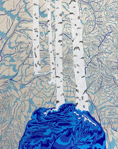
Art can help too; NCA5 showcases a gallery of art inspired by climate change in the U.S. Art X Climate is the first art gallery to be featured in the National Climate Assessment and was created with the understanding that, together, art and science move people to greater understanding and action. View the art gallery

Acrylic painting, Rivers Feed the Trees, but Meredith Nemirov.
Rivers Feed the Trees #467 (Aquifers) by Meredith Nemirov. 2022, Acrylic on historic topographic map. Artist's statement: "Rivers Feed the Trees is a series of works on historic maps where blue is painted into the topography to create an abundance of rivers and streams. Since the turn of the 21st century, Colorado has experienced periods of extreme drought. This inspired me to create works where I imagine a Colorado with no drought. I hope these images will encourage people to learn more about where our water comes from and to look for solutions to the dire situation we are facing regarding the future of our water."