New Tools Help Visualize the Future of Drought
How much rain is it going to take for this drought to get better?
What’s the likelihood that the drought will be over a month from now?
If it doesn't rain again for the rest of the month, how bad could the drought get?
Questions like these start creeping in when the landscape browns, when streams get low, when the sun starts baking our gardens. Californians were among those contemplating such things as drought intensified there from 2011 into this past winter. Folks in the Dakotas are asking those questions now. How bad can it get?
There’s a tool that can help answer. Drought Termination and Amelioration pages from NOAA’s National Centers for Environmental Information (NCEI) offer a customizable interface anyone can use to find information on
- The amount of precipitation necessary to end or ameliorate a drought
- The percent of normal precipitation needed to end or ameliorate a drought
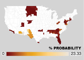
- The likelihood that that amount of precipitation would fall
The Palmer Hydrological Drought Index for June 17, 2017: green designates moister areas, oranges and browns drier areas. Find more information on the Palmer
Users can designate a state or the nation, and choose the time period, from one to 12 months to end or ameliorate the drought.
For those who prefer their glass half empty, there’s a Worst Case Scenario page that offers the same information – amount, percent of normal and probability of precipitation to end or ameliorate a drought – but assumes there will be no precipitation for the rest of the month.
Maps are updated daily, based on the Palmer Hydrological Drought Index (PHDI), which assesses the severity of current drought conditions in the U.S.
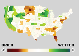
For those who’d like to peek into the possible future, the Projected Drought page offers maps showing what researchers think the PHDI could look like in the future, based on projected monthly temperature and precipitation values from NOAA’s Climate Prediction Center, along with historical data. These maps answer the question, "If the seasonal forecast from CPC is correct, what would the drought look like three months from now?"
In addition to the maps, users will find the data used to create them in XML, CSV, JSON and ASCII formats.
For more information, visit https://www.ncdc.noaa.gov/temp-and-precip/drought/recovery/overview