2020 in Review: A Look Back at Drought Across the United States in 12 Maps
2020 USDM Weekly Maps Animation
This animation displays the weekly drought maps published by the U.S. Drought Monitor (USDM) during 2020. Drought in 2020 began with the Northwest, Four Corners, and Texas in drought and ended with intense drought from the Plains to the West Coast, with a large area in the Southwest and West Texas in Exceptional Drought (D4), the highest level. Florida went in and out of drought in 2020. The Northeast is following a similar pattern at year end. As for South Texas, the region started the year with some drought, which worsened, then improved, and worsened again.
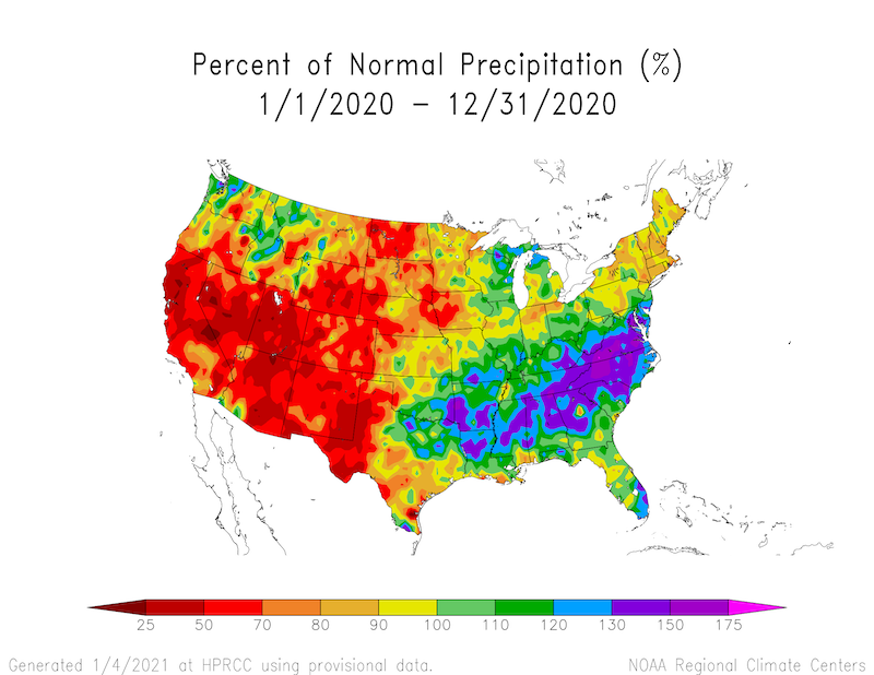
Year-to-Date Percent of Normal Precipitation
In general, it was an extremely dry year from the Great Plains to the West Coast. The South/Southeast into the Midwest and Mid-Atlantic saw the most precipitation in 2020. The Upper Midwest and Northeast leaned dry, but conditions are improving as we move into 2021, particularly in the Northeast.
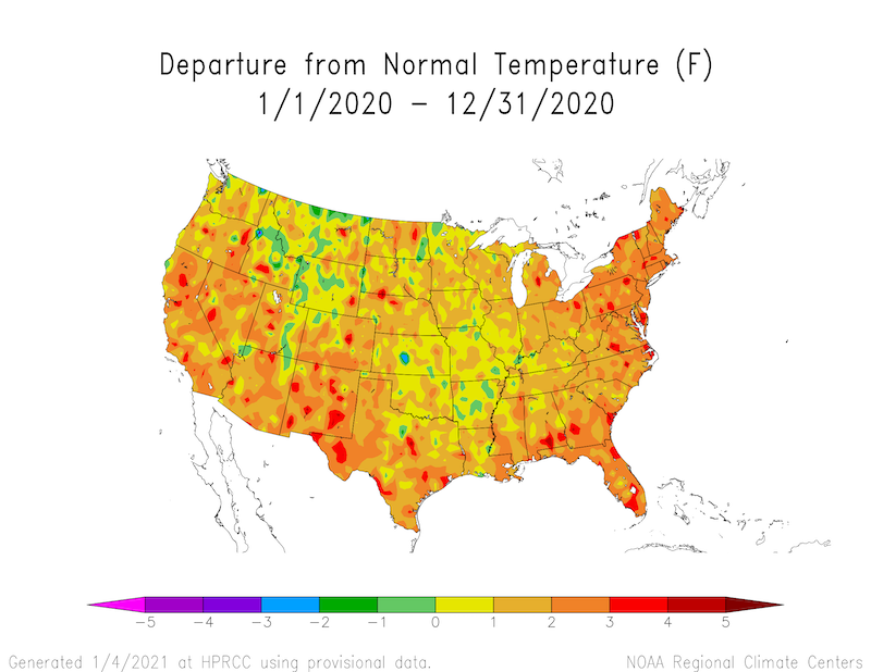
Year-to-Date Departure from Normal Temperature
As shown on the year-to-date departure from normal temperature map, it was a relatively warm year.
2020 USGS Streamflows Animation
What started as a relatively healthy year for streamflows across the USA, particularly in the Midwest, deteriorated as drought moved across the lower 48. California and the Northwest saw extremely low streamflows first, followed by deterioration in the Southwest and West Texas. The Colorado River Basin and the Northeast then showed massive declines next, with the Northeast improving at year’s end.
2020 USGS Groundwater Animation
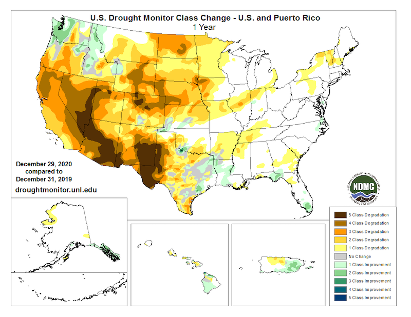
2020 U.S. Drought Monitor Year-to-Date Change Map
2020 has seen mostly drought degradation, with a full 5 class degradation in parts of the Southwest. Even the few regions or states with improvement, such as the Northwest or Florida, also saw degradations.
2020 Weeks in Drought
This map shows the number of weeks, throughout the year, a location experienced drought, defined as USDM category “D1 – Moderate Drought” or greater, across the United States. Parts of the Northwest, Four Corners, and a small pocket in Southwest Texas were in drought throughout the entire year.
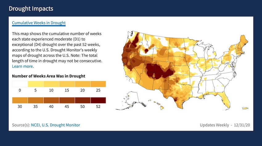
Figure 7. Map displays the number of weeks during 2020 the U.S. experienced USDM Category D1 or greater. Learn more.
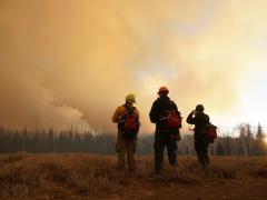
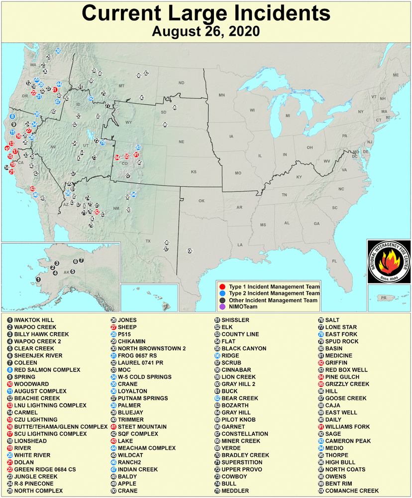
Large Fire Incidents - August 26, 2020
The extreme heat across the West over the summer, along with persistent drought, led to an explosion in large wildfires. On August 26, there were 100 large fires in the U.S., according to the National Interagency Fire Center. Of these fires, 15 were managed by Type 1 Incident Management Teams (red circles on map). For all of 2020, there were 58,258 fires covering 10,274,679 acres. Interestingly, while the number of fires was below the 10-year average of 62,822, the number of acres burned was much above the average of 6,789,149.
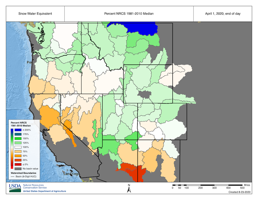
Snow Drought 2019-20
The seeds of Drought 2020 were laid over the winter of 2019-2020. The western snow season is typically considered to end around April 1. The 2019-2020 snow season ended with a few regions in snow drought, including part of the Lower Colorado River Basin in Arizona and New Mexico, the Sierra Nevada, the Great Basin, and parts of the Cascade Range.
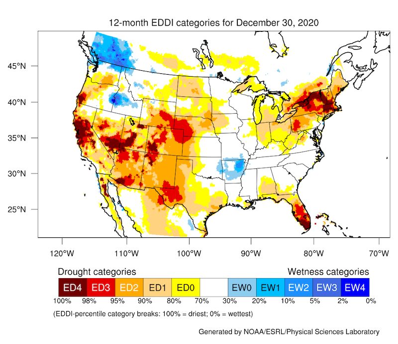
Evaporative Demand Drought Index (EDDI)
The Evaporative Demand Drought Index (EDDI) is an experimental drought monitoring and early warning guidance tool. It examines how anomalous the atmospheric evaporative demand (E0; also known as "the thirst of the atmosphere") is for a given location and across a time period of interest. EDDI can offer early warning of agricultural drought, hydrologic drought, and fire-weather risk. The driest areas on the 12-month EDDI include Central CA, the Southwest, West TX, the Northeast and Western PA, parts of the Rockies and Plains, FL, and pockets in other states.
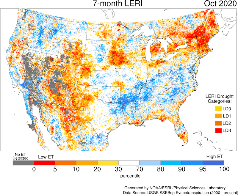
Landscape Evaporative Response Index (LERI) - Growing Season 2020
The Landscape Evaporative Response Index (LERI) is an experimental drought-monitoring tool that measures the anomaly in the actual evapotranspiration (ETa) from the land surface. Work is ongoing to evaluate the early warning potential for agricultural and ecological droughts, flash drought, and wildfire risk. The 7-month LERI map shows that severe to extreme drought occurred in the growing season (April-October) in a large swath of the southwestern U.S., Great Basin, and Rockies (with the gray signifying extreme arid conditions). Other large areas showing severe to extreme drought during the growing season included the Northeast, Western IA and MN into the surrounding states, and MI.
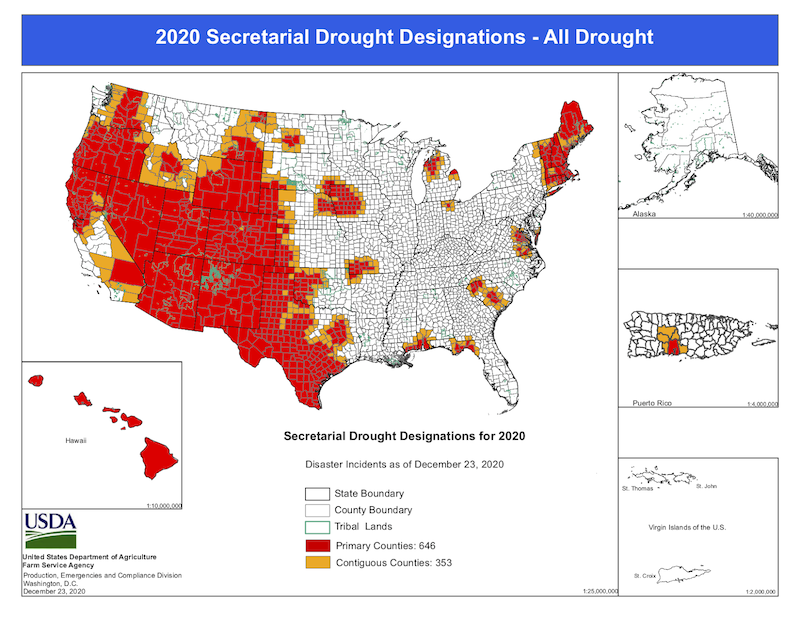
2020 USDA Drought Designated Counties Map
The Secretary of Agriculture is authorized to designate counties as disaster areas to make emergency loans (EM) available to producers suffering losses in those counties and in counties that are contiguous to a designated county. In addition to EM eligibility, other emergency assistance programs, such as Farm Service Agency disaster assistance programs, have historically used disaster designations as an eligibility trigger. The Plains to the West Coast, the Northeast, Hawaii, as well as pockets in the Midwest and South/Southeast received drought designations in 2020.